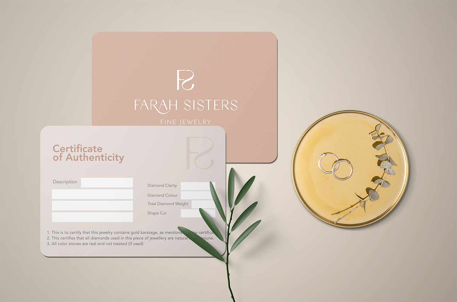
Farah Sisters is a jewelry brand created by two sisters passing on the business from one generation to the other.
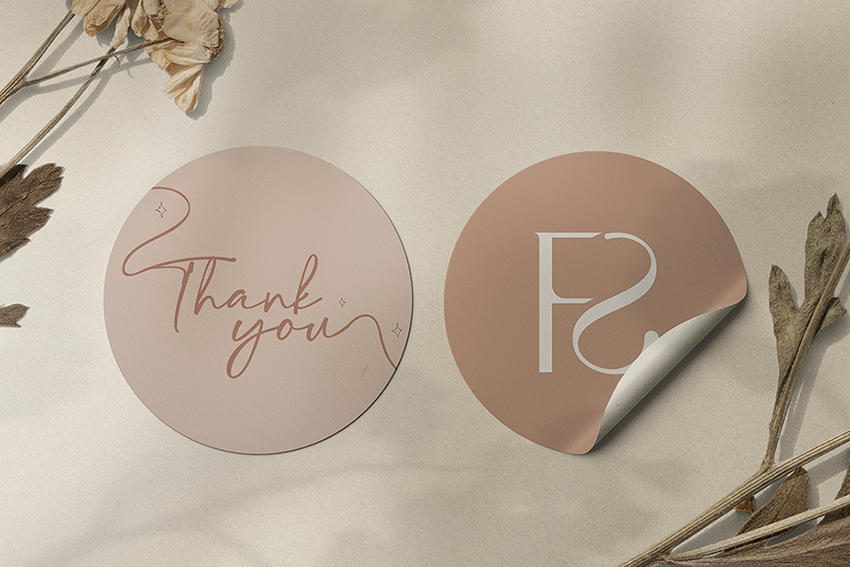
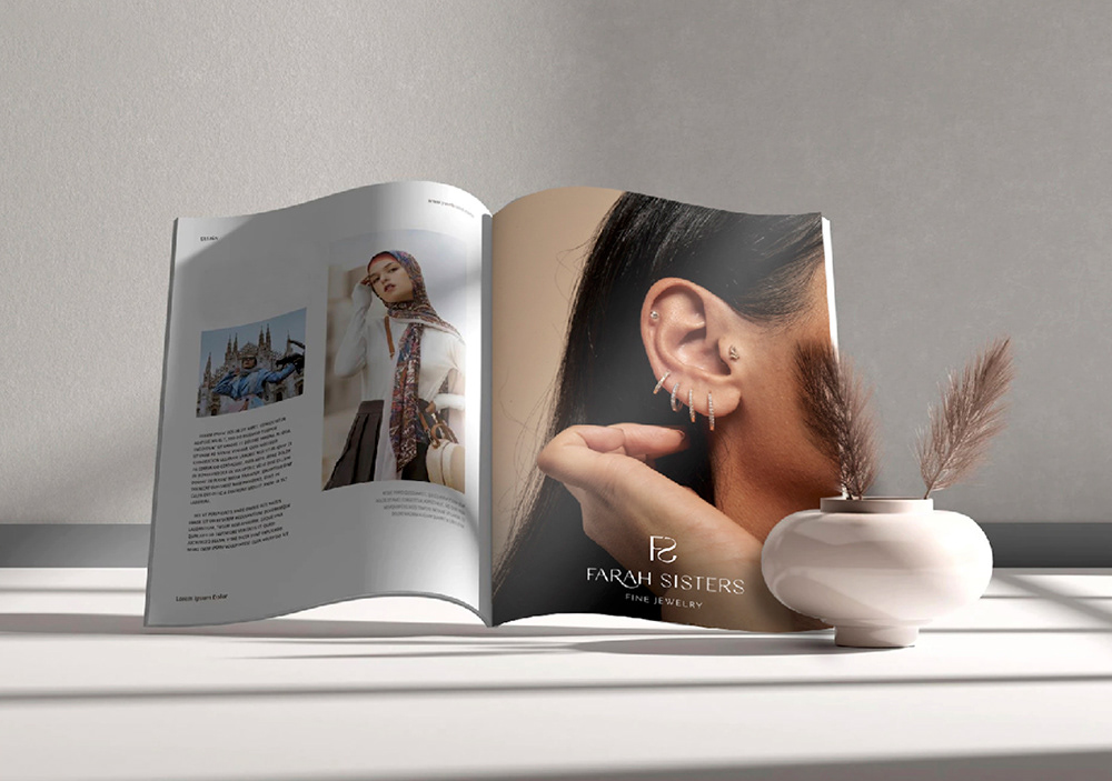
This project encloses of a slight logo uplift that was requested while keeping the same spirit, and the branding on some items that will be included in the packaging and delivery of Farah Sisters items.
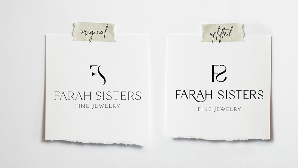
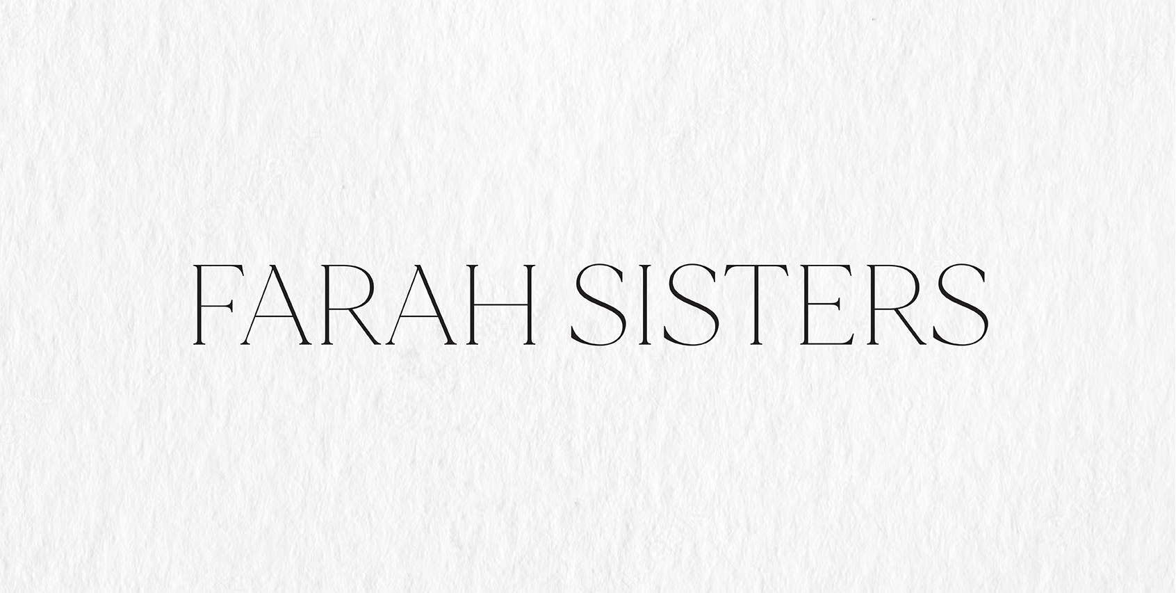
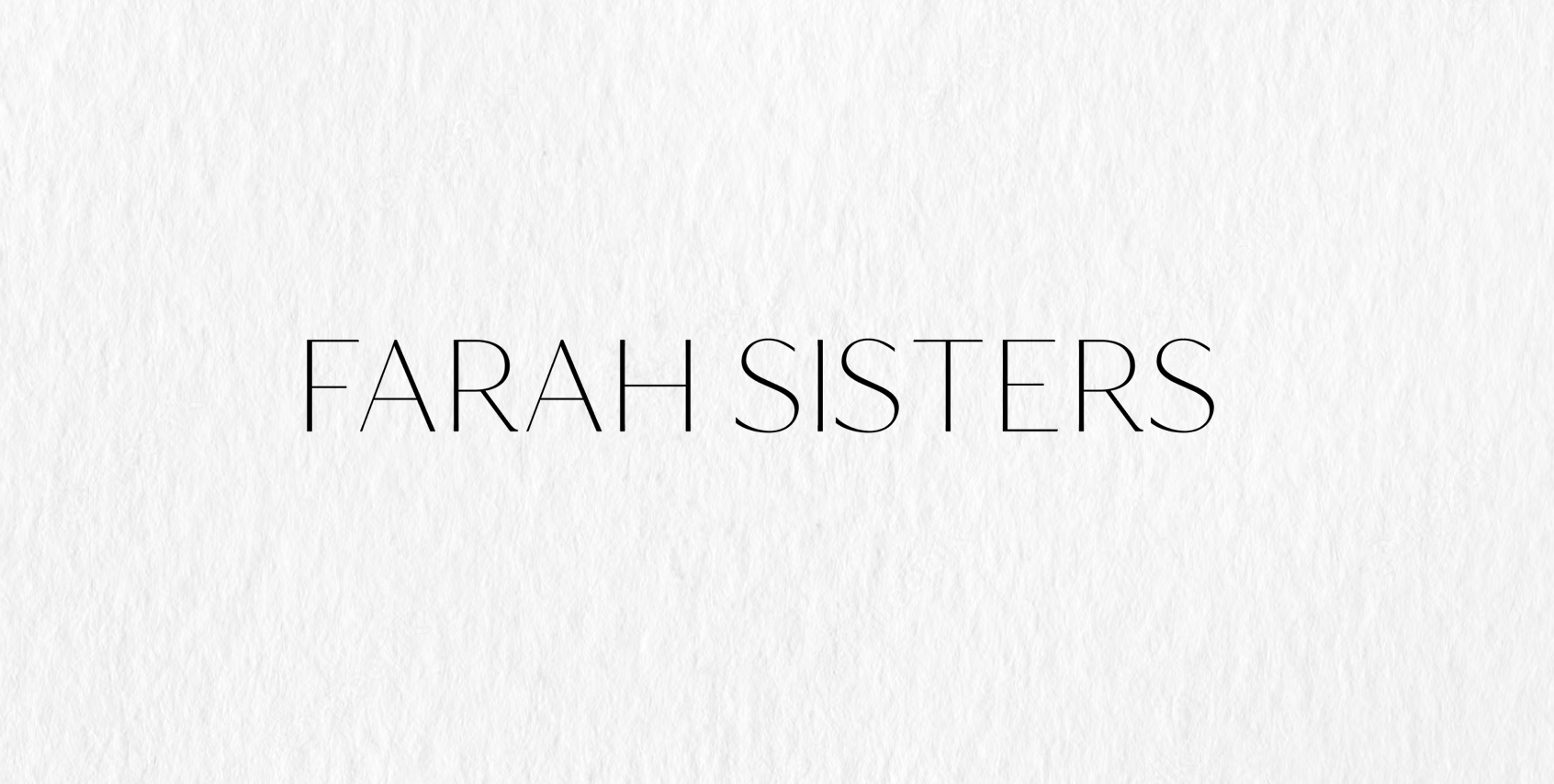
The process started by extracting the same typeface used in the original version, and removing its serifs for a more modern look.
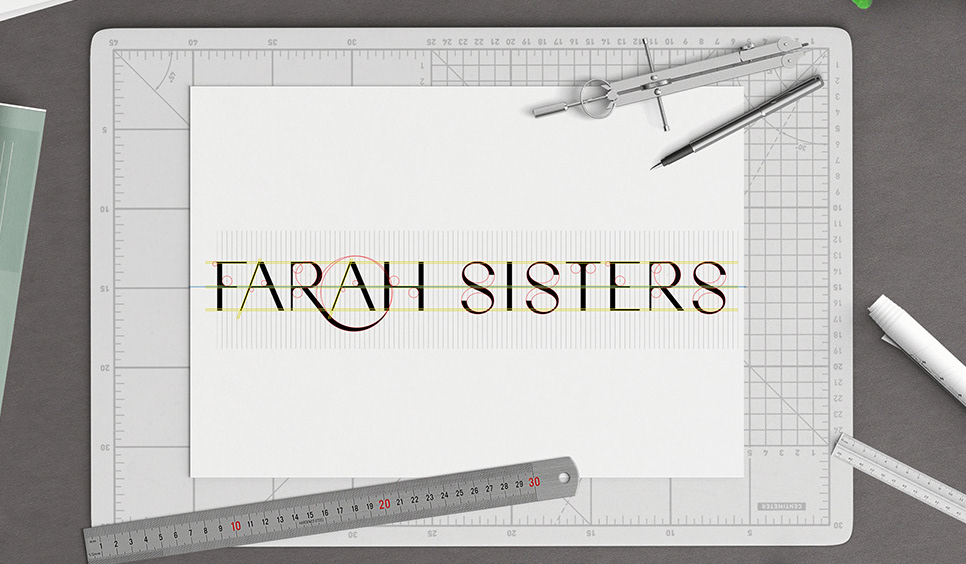
Step two consisted of adding thickness to the stroke for better eligibility.
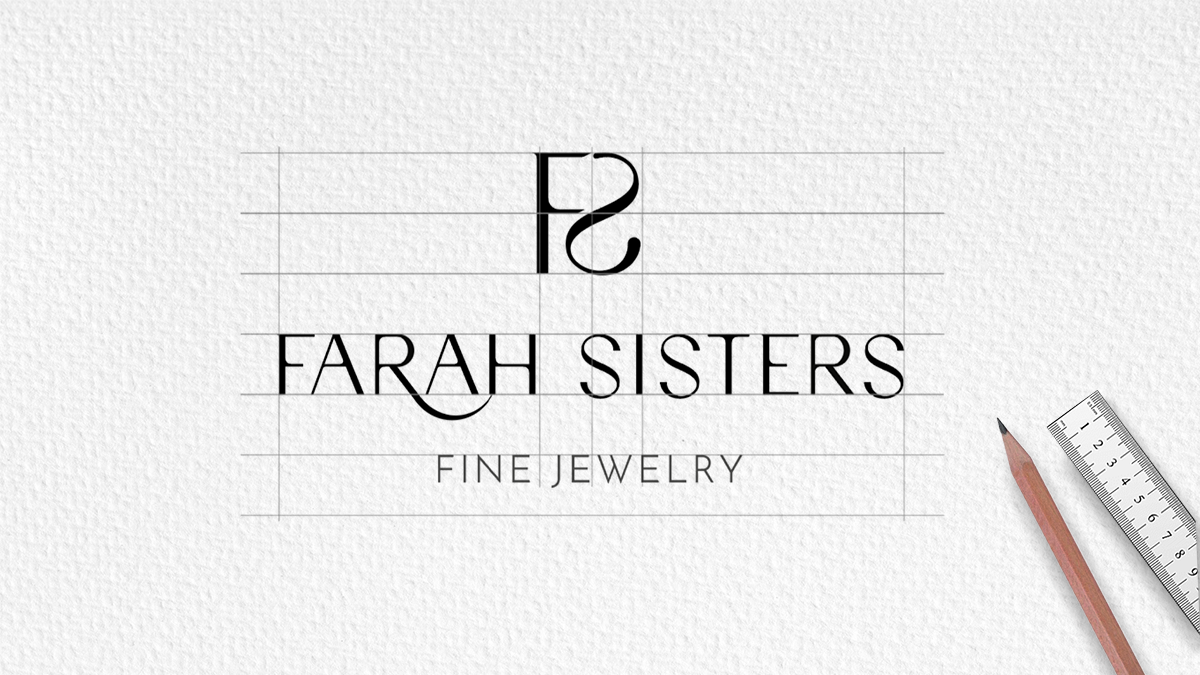
Step three, using the above sample of a typeface, a grid was created to amend the font and add a little life to it.
After finalizing the typeface, time to experiment with the initials: F & S, finding a smooth connection in between.
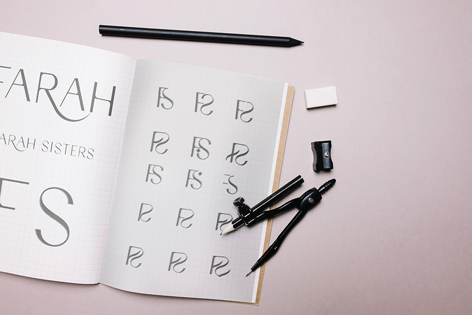
Now let's combine all elements within a balanced grid.
Color palette

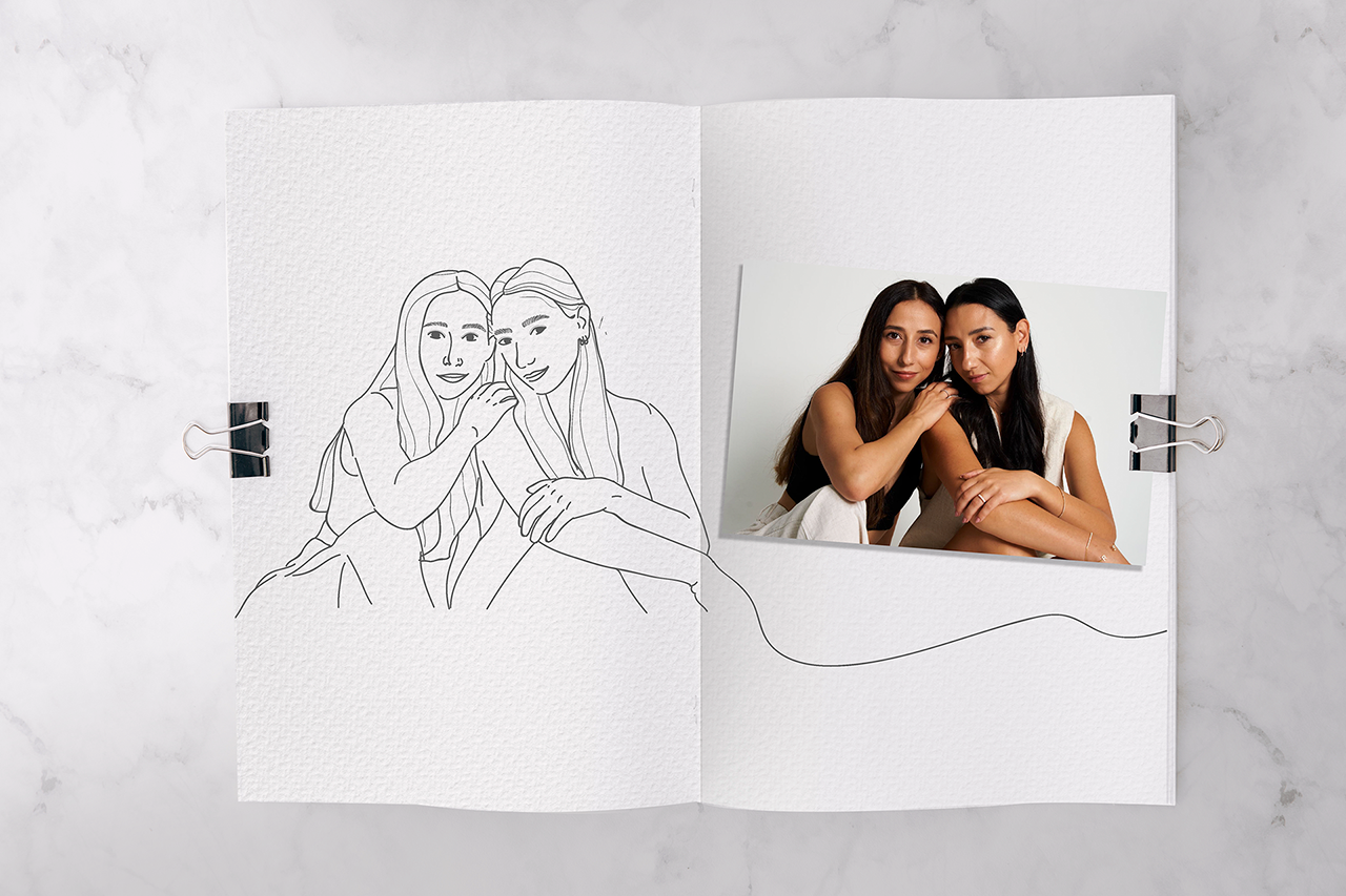
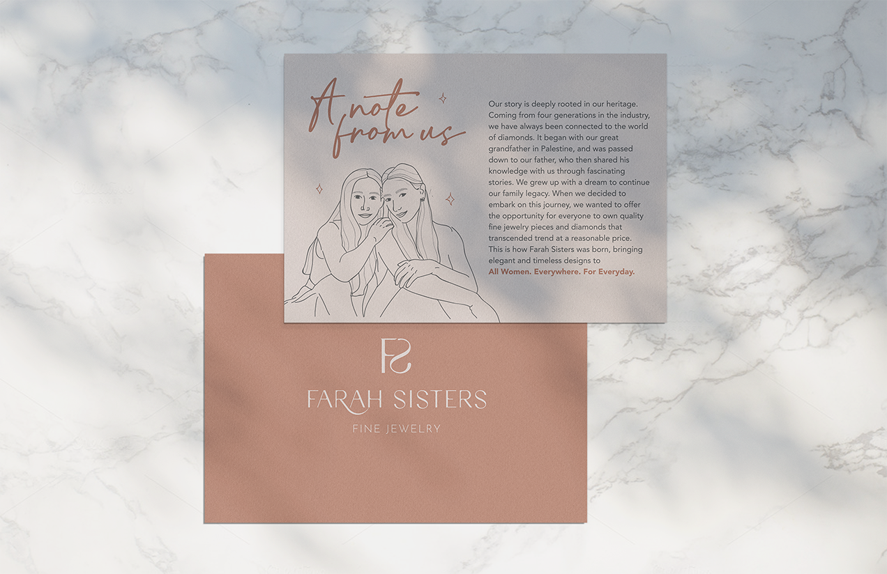
A portrait illustration of Tala & Rowan Farah, the founders of Farah Sisters for